Kairong Wu
Communication Arts (Graphic Design)
About
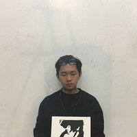
Hi, this is Kai. I am born and raised in China, and started my design studies at the States in the year 2017. During these four years, integrating different cultures has expanded my knowledge to my studies and life. Most importantly, meeting such great people that have walked into my life has motivated me to experiment further within the design field. Please visit my page to view some of the works that are inspired by my friends and the stories that took place in my life.
kaiwart.com
Contact
kwu@student.otis.edu

This is a manifestation poster that shows my interests and fervid loving to typography arts, particular music genres including Rhythm & Blues, Bachata and Asian Adult Contemporary, as well as the showing the admiration to different language systems including Spanish, Korean, Chinese. Alongside with a English paragraph as the translation that serves the purpose on helping the audience to acknowledge the message that lies within the design.
-
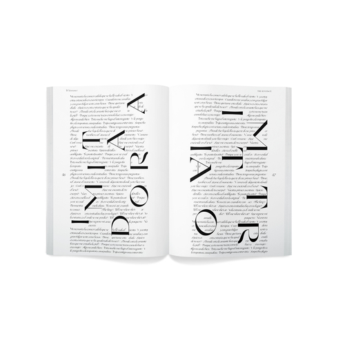 This is a publication that showcases the ability on how letter and particular composition design strategy on creating beautiful aligned spreads.
 -
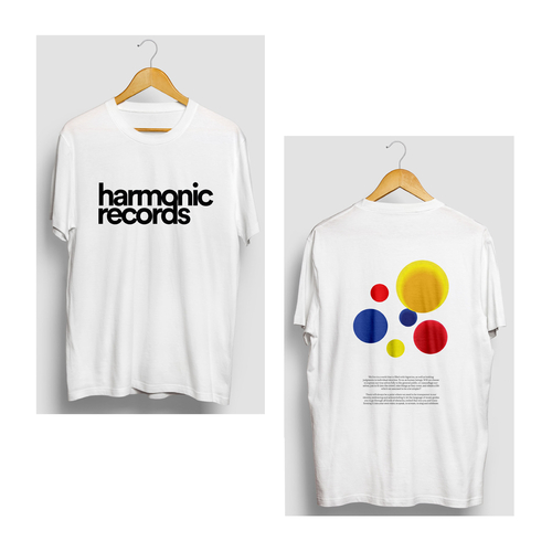 Before Incandescent Sounds, it was Harmonic Records. This is a pseudo record label which shares the purpose on promoting recording artists who holds different backgrounds and colliding the particular cultures altogether. The same as to the color selections for the overall outlet, which is red yellow and blue, and utilizing their collision movement as a metaphor to the cultural embracement statement. Since it is a music marketing focused outlet, the ideas of designing promotional products such as wearables, pins and overall compact disc packaging are considered the few main design outcomes for this project.
-
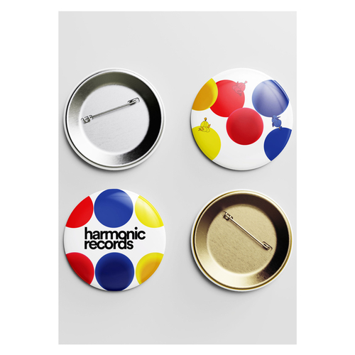 Before Incandescent Sounds, it was Harmonic Records. This is a pseudo record label which shares the purpose on promoting recording artists who holds different backgrounds and colliding the particular cultures altogether. The same as to the color selections for the overall outlet, which is red yellow and blue, and utilizing their collision movement as a metaphor to the cultural embracement statement. Since it is a music marketing focused outlet, the ideas of designing promotional products such as wearables, pins and overall compact disc packaging are considered the few main design outcomes for this project.
 -
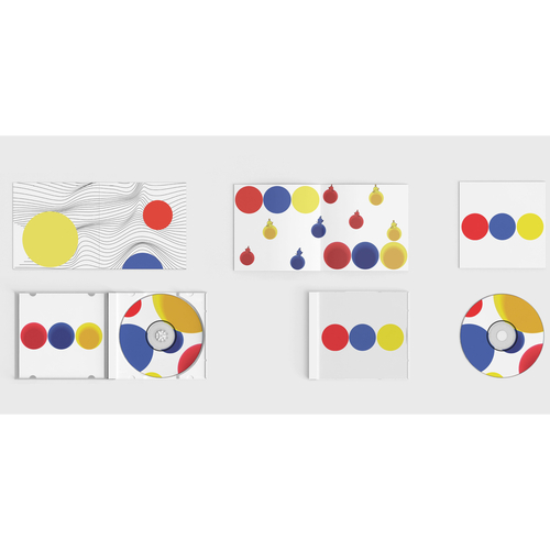 Before Incandescent Sounds, it was Harmonic Records. This is a pseudo record label which shares the purpose on promoting recording artists who holds different backgrounds and colliding the particular cultures altogether. The same as to the color selections for the overall outlet, which is red yellow and blue, and utilizing their collision movement as a metaphor to the cultural embracement statement. Since it is a music marketing focused outlet, the ideas of designing promotional products such as wearables, pins and overall compact disc packaging are considered the few main design outcomes for this project.
-
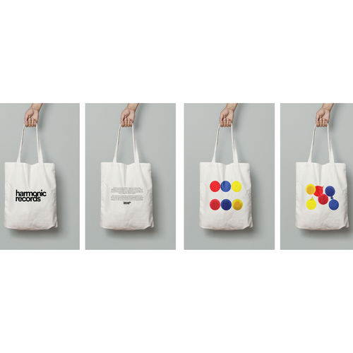 Before Incandescent Sounds, it was Harmonic Records. This is a pseudo record label which shares the purpose on promoting recording artists who holds different backgrounds and colliding the particular cultures altogether. The same as to the color selections for the overall outlet, which is red yellow and blue, and utilizing their collision movement as a metaphor to the cultural embracement statement. Since it is a music marketing focused outlet, the ideas of designing promotional products such as wearables, pins and overall compact disc packaging are considered the few main design outcomes for this project.
All Communication Arts Students
- Brandon Bailey
- Karen Barton
- Esmeralda Benavidez
- Kiv Bui
- Brandon Burris-Davis
- Celeste Carrillo
- Maria Carrillo
- Catherine Chow
- Ivan Cisneros
- Benjamin Dynes
- Diana Espinoza
- Lucas Guerra
- Joel Harris
- Matthew Horn
- Khang Nguyen
- James Oakey
- John Olague III
- Colton Ollerdessen
- Shengjie Qu
- Isabella Reyna
- Jazmin Salas
- Taylor Seo
- Kiana Tenerelli
- Veronica Velazquez-Aviles
- Angel Wang
- Kairong Wu
- Elizabeth Zamets
